This is part of a series about the scrapbooking booths I visited at CHA 2016. If you’d like to see all the posts in the series, please click HERE.
Guess where I went next?
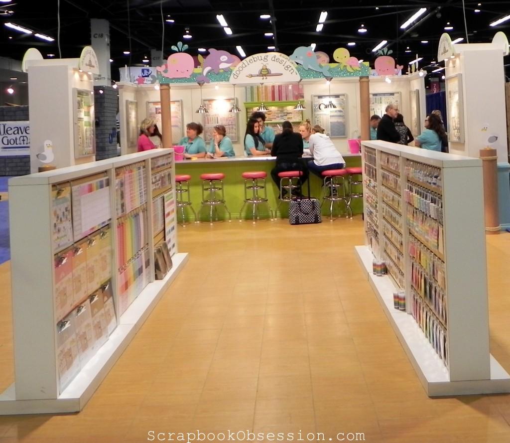
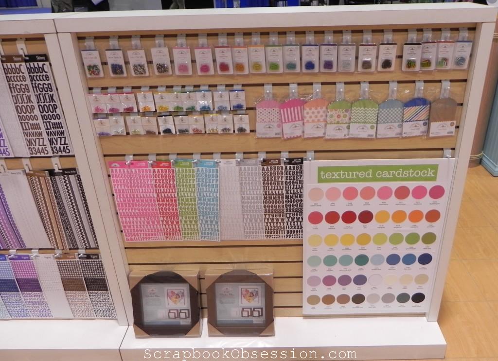
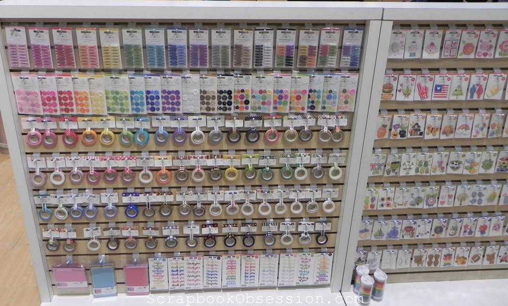
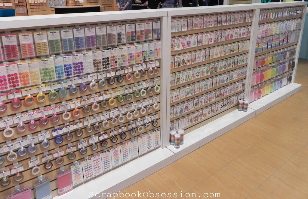
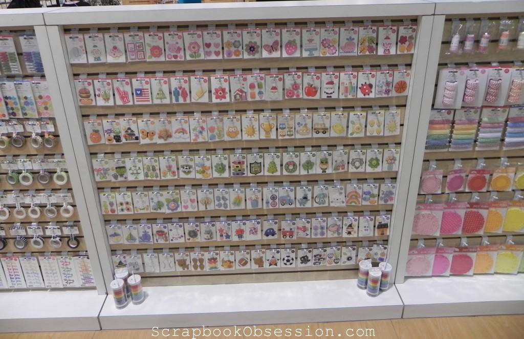
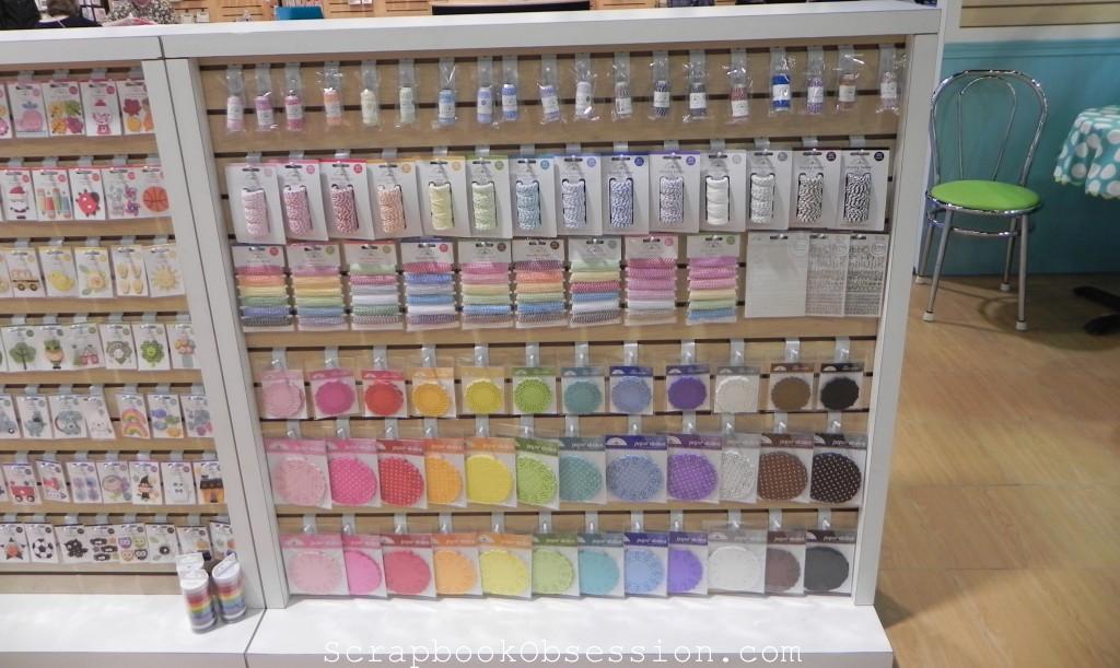
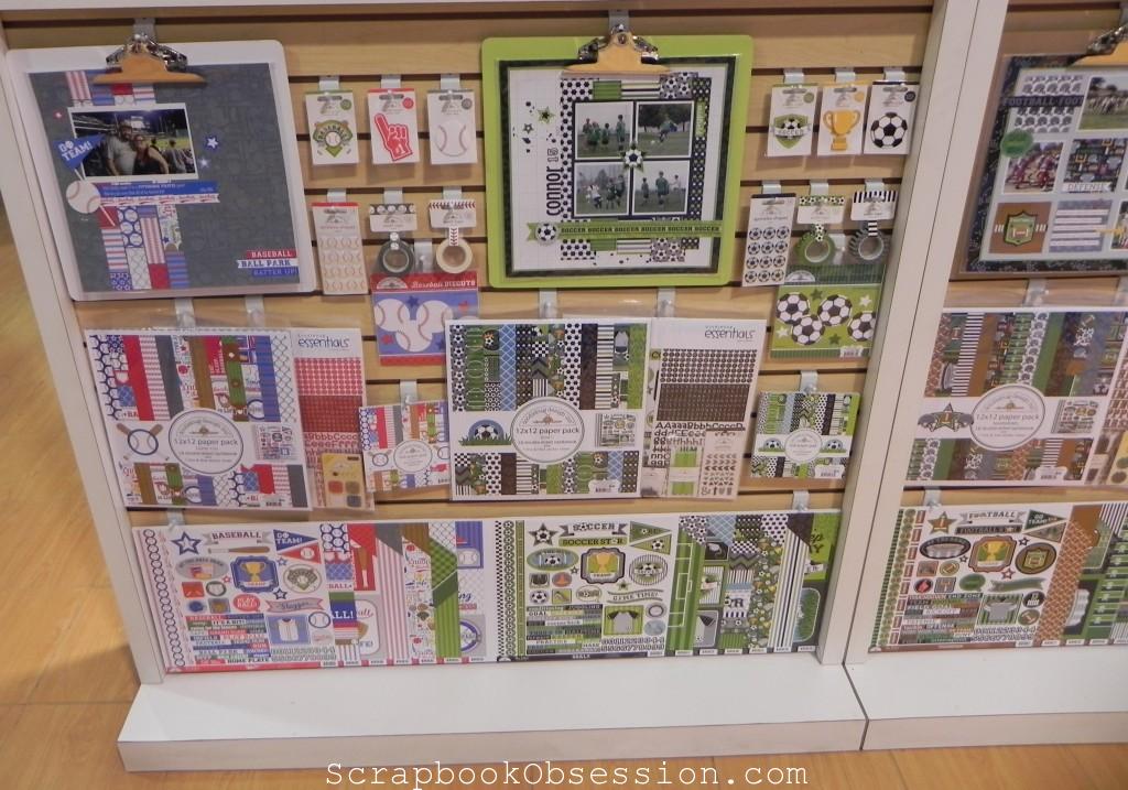
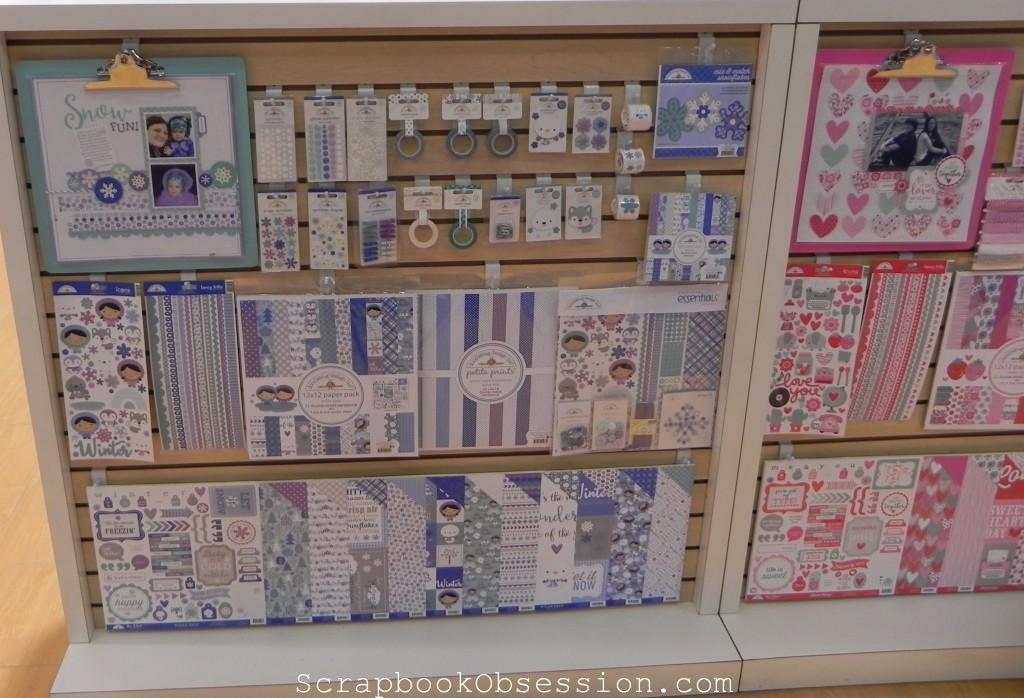
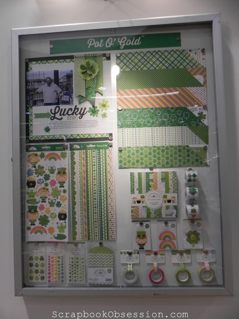
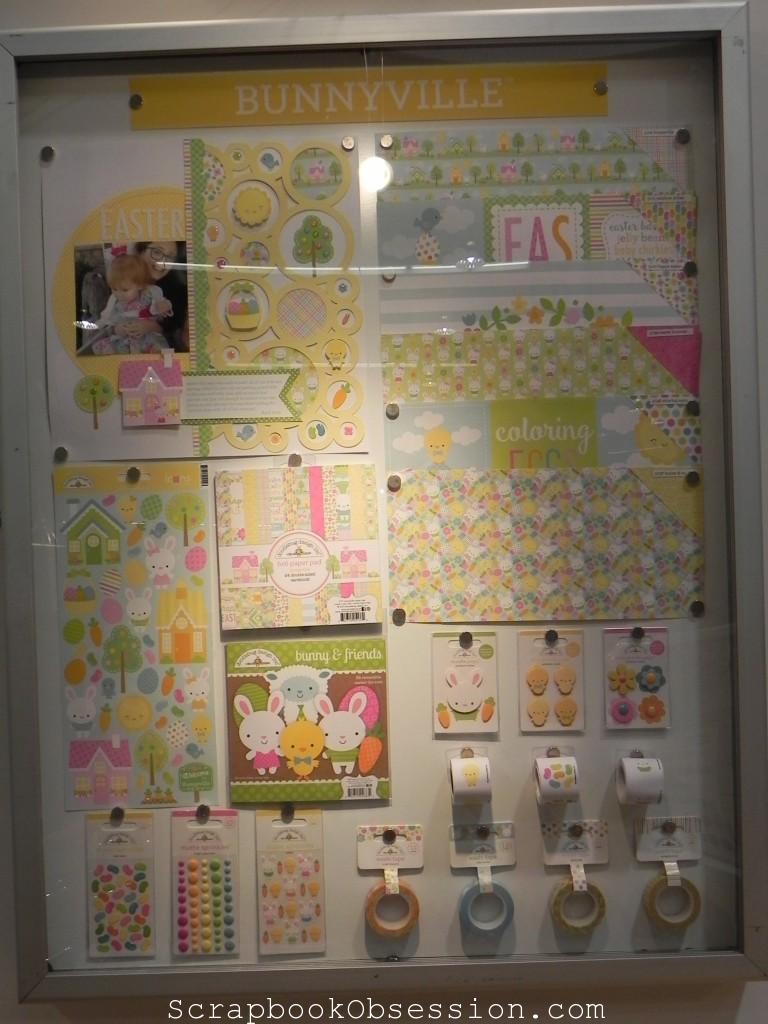
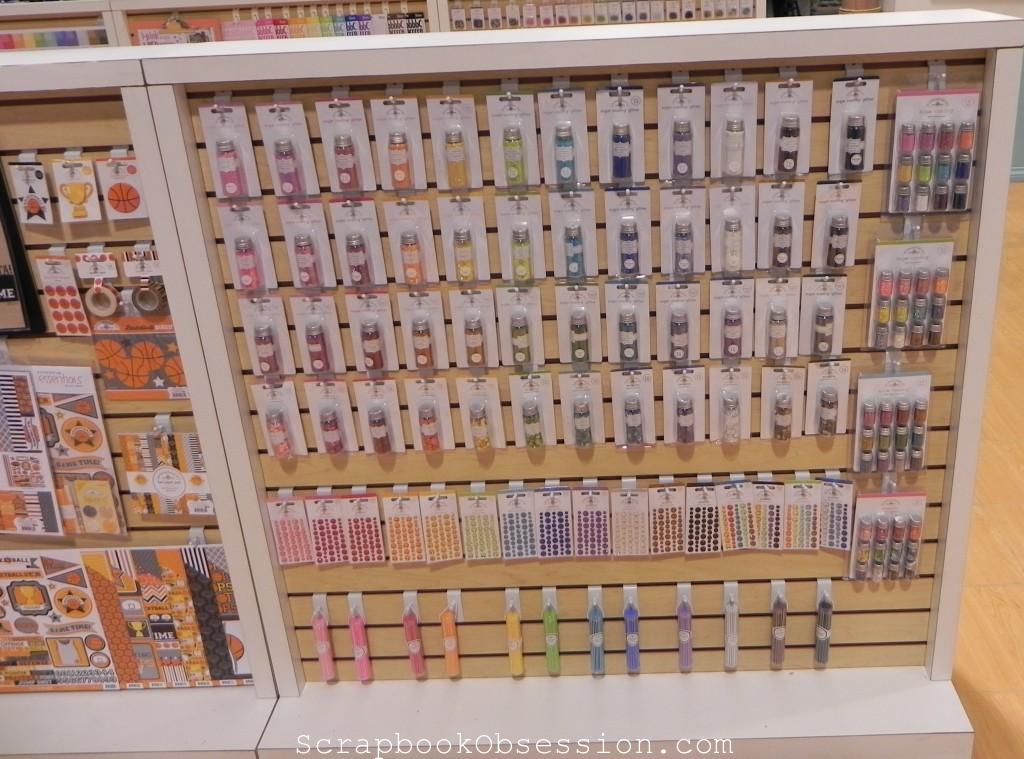
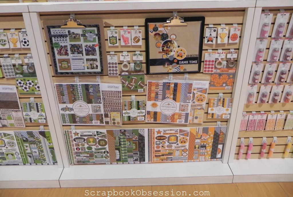
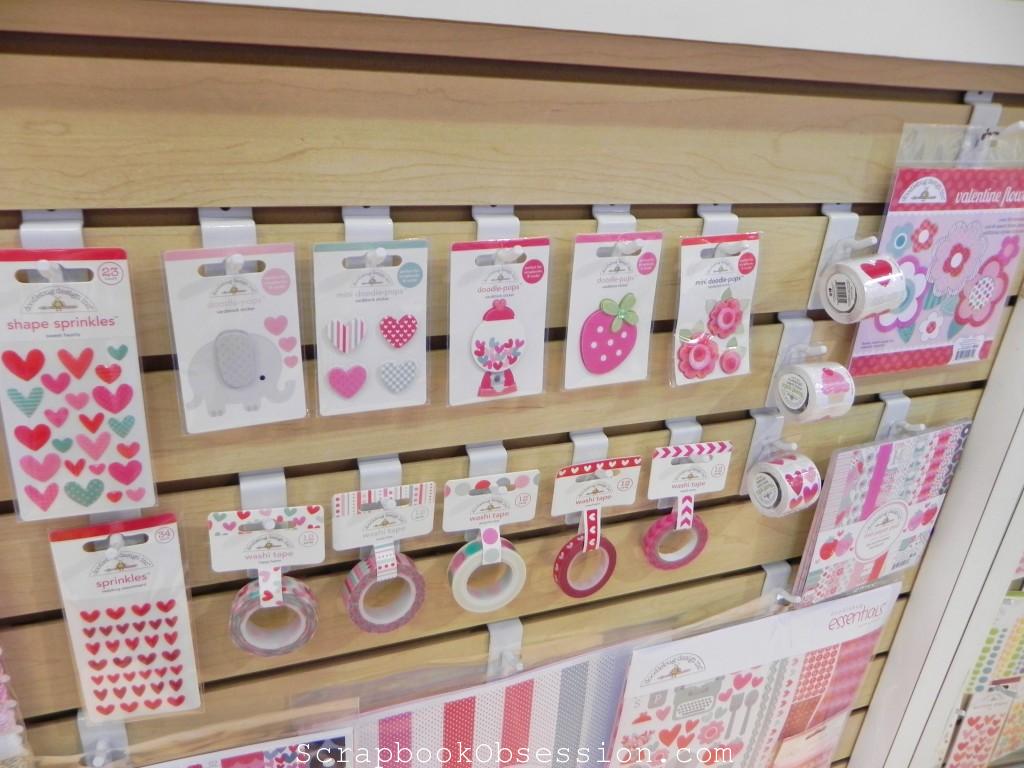
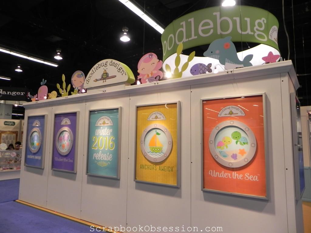
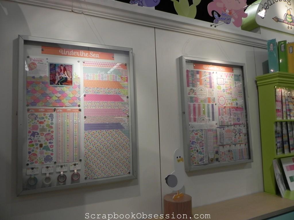
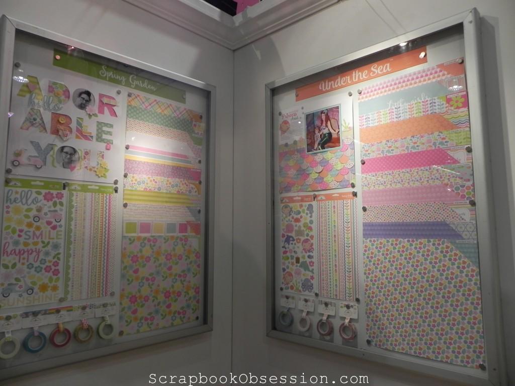
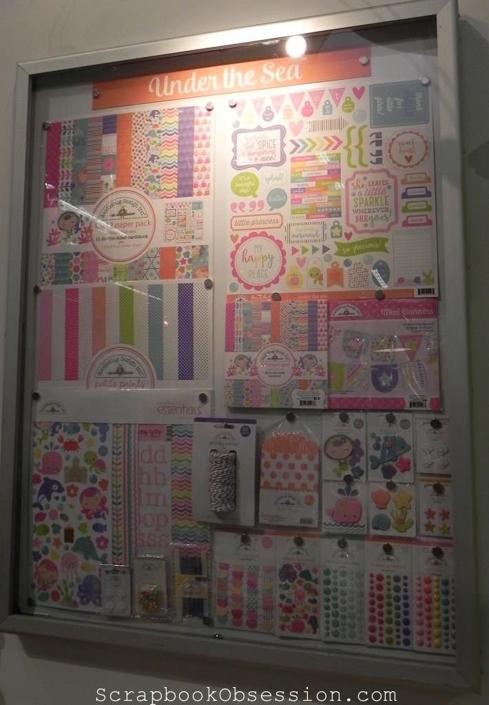
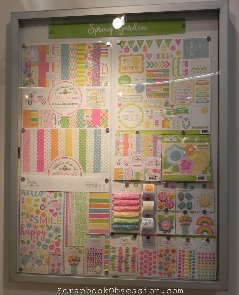
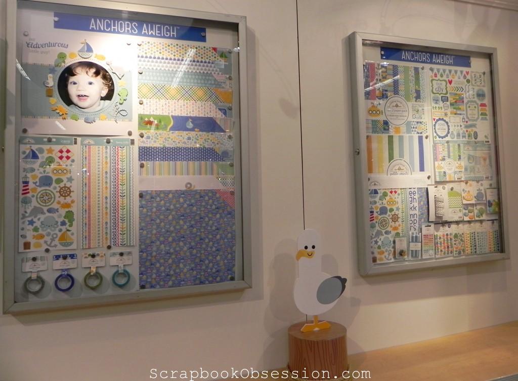
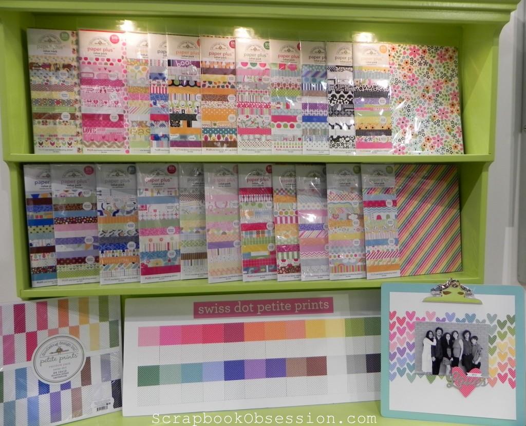
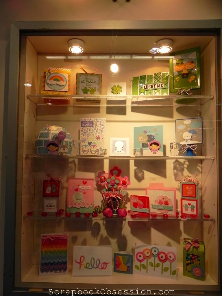
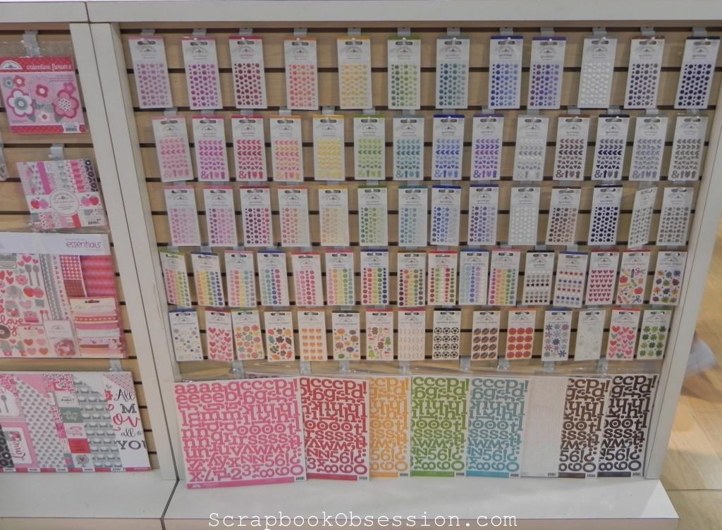
I think Doodlebug’s booth is the happiest-looking place in all of CHA :) I think I’ll just let you take it all in, then I’ll do most of my talking at the bottom.
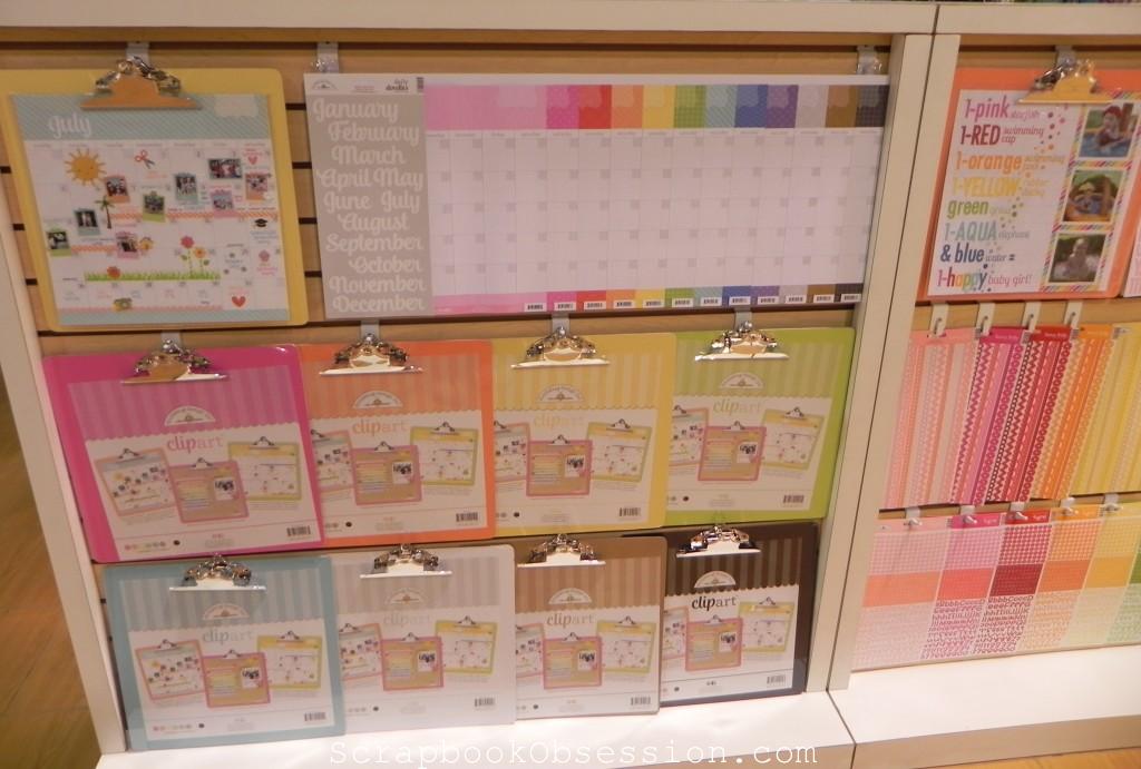
Cute calendar system. I haven’t seen one like this before!
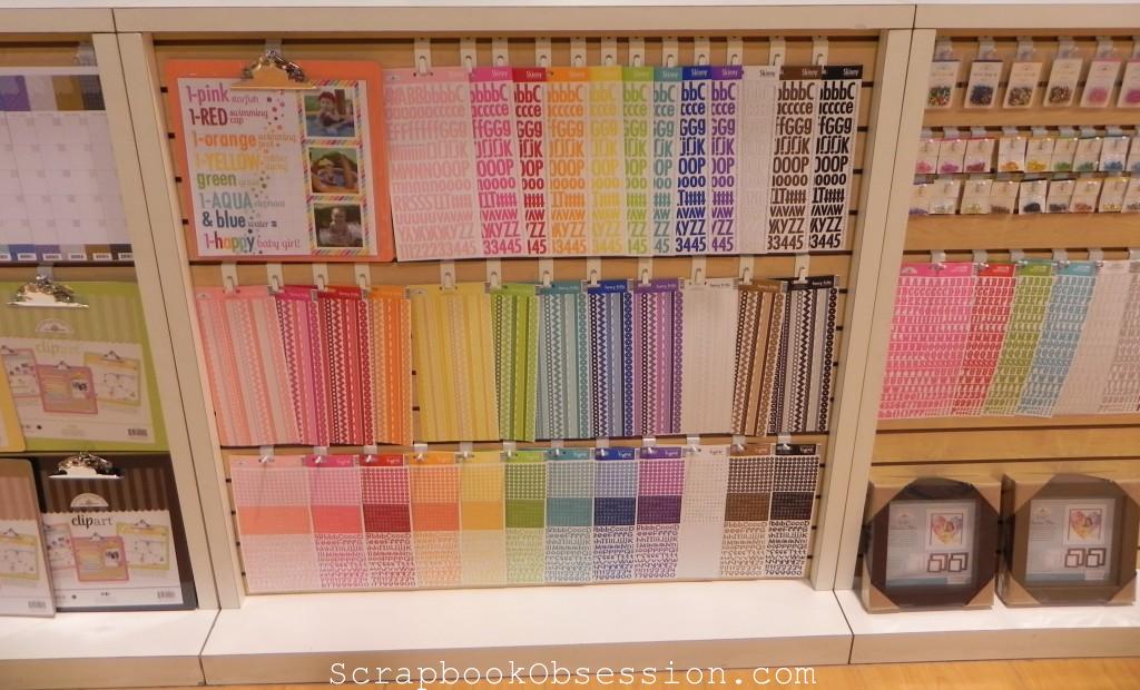
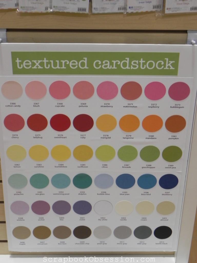
I didn’t know Doodlebug had so many colors of cardstock either.
I asked what their most popular line was and she thought probably this one – Under the Sea. I can “sea” why! Har har … Thanks folks! I’m here ’til Sunday. Try the veal!
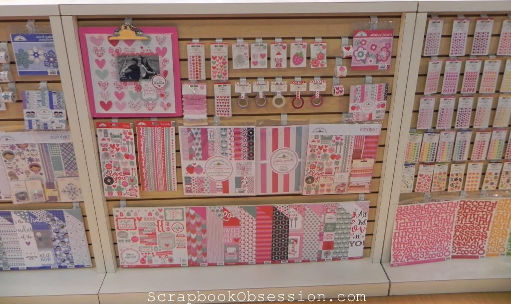
LOVE the hearts layout!
The nice lady I talked to was a sister of the owner. Her other sister designed the layout I admired above with the hearts.
So it turns out that Doodlebug Designs is a total family affair! In addition to the owner’s two sisters being part of the biz, her son works in the warehouse, his girlfriend works there (she handed me a catalog when I walked in), another son was working the booth, and an aunt just retired from Doodlebug. Isn’t that cool?
Check out their BLOG for another look at their happy products!
Back in the Day, I posted THIS tutorial I found that shows you how to “go around the corner” with the famous Fiskars THREADING WATER punch.
Now, thanks to SCRAPSCENE, I found THIS great tutorial for another way to use your Threading Waters punch. It’s on Crystal aka Scrapper Mom’s BLOG. She has some other great tutorials on there…go check it, ladies!
Here is
CRYSTAL’s LAYOUT
where she used the trim made with her TW punch.
The technique Crystal shares in her tutorial is how she made the red strip. I love how it replicates the yellow sun rays, which look to be made from Doodlebug strips. And, hey! I spy some Fancy Pants SUMMER SOIREE in that layout, don’t I? See, I like this girl. Excellent taste, LOL!
Enjoy Crystal’s gorgeous layout and her cool tutorial. Cheers!
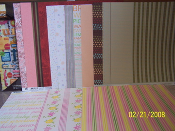
In THIS POST the other day, I told you about my 3 scrap-shop-stops @ Michaels, a craft store, and my LSS. Here are pics of my haul…
PATTERNED PAPERS:
On the far left is the MAMBI kit, merely called “Family” from Michaels. It has cool primary colored papers and lots of rub-ons and Soft Spokens related to family togetherness. But what sold me were the three lines of orange, green and blue blingees AND the chipboard sheet with large circles, which I’ve been needing to complete a layout from EASY PATTERNS for ages. Anyway, all their kits were 40% off, whoo hoo. Come to think of it, I should have gotten more (uh, dork!).
Next is 2 sheets of Chatterbox called “Sweetheart Roses,” one side with a modern flower design, the other solid pink. Then I think my fave PP of the day, 2 sheets of “Affection” by Prima. One side is deep color stripes, the other deep red roses. I love the roses so much, I think I’ll use both sheets as roses and just forget the stripes! But isn’t that always the challenge of double-sided paper? You love both sides, like two children you’ve given birth to, how do you CHOOSE!?! Next are a couple of sheets of “Pastel” Doodlebug (polka dots & flowers), then a random stripey one, then 2 more older sheets of “Obviously Orange” Doodlebug with a bright summer theme. And lastly, on the far right, 2 sheets from “Jack+Abby” by Love, Elsie. That ledger style on the last sheet caught my eye, then I found the brown circles paper to go with it. On the very bottom of the pic are 3 sheets of very Spring-y papers from Bo Bunny Press called “Lil Princess.” The photo doesn’t do them justice because the colors are really WOW, very cheery and bright. All 3 are double-sided with pink, yellow and green on the back sides and thick like cardstock.
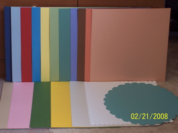
Now for the BAZZILL:
Is something seriously wrong with me that I get such overwhelming JOY looking at all that Bazzill cardstock?? On the top row are the sheets with either linen or grasscloth texture; ooh, such purdy colors. The bottom row is Bling and then a couple scallop designs. Proud to say I only paid full price for 2 sheets from all that PP and cardstock. Wicked cool.
Okay, well, it’s been decided. I’m not going admit I have a problem, because if I do, that would be the first step in my recovery. And I don’t wanna recover…so there! I ENJOY being addicted to paper. I EMBRACE my obsession with texture and color and design. I’m NOT embarrassed to admit that I love the smell of paper and the weight of it in my hands when it’s all stacked nicely, corners matching up perfectly. So, are ya’ with me??